Back to: Python Programming
The Checkbutton widget is a standard Tkinter widget that is used to implement on/off selections. Checkbuttons can contain text or images. When the button is pressed, Tkinter calls that function or method.
Tkinter Checkbutton Widget Syntax
The syntax to use the checkbutton is given below.
Syntax: Checkbutton ( master, options)
Parameters:
- master: This parameter is used to represents the parent window.
- options:There are many options which are available and they can be used as key-value pairs separated by commas.
Tkinter Checkbutton Options
The following are commonly used Options that can be used with this widget:
- activebackground: This option used to represent the background colour when the checkbutton is under the cursor.
- activeforeground: This option used to represent the foreground colour when the checkbutton is under the cursor.
- bg: This option used to represent the normal background colour displayed behind the label and indicator.
- bitmap: This option used to display a monochrome image on a button.
- bd: This option used to represent the size of the border around the indicator and the default value is 2 pixels.
- command: This option is associated with a function to be called when the state of the checkbutton is changed.
- cursor: By using this option, the mouse cursor will change to that pattern when it is over the checkbutton.
- disabledforeground: The foreground colour used to render the text of a disabled checkbutton. The default is a stippled version of the default foreground colour.
- font: This option used to represent the font used for the text.
- fg: This option used to represent the colour used to render the text.
- height: This option used to represent the number of lines of text on the checkbutton and it’s default value is 1.
- highlightcolor: This option used to represent the color of the focus highlight when the checkbutton has the focus.
- image: This option used to display a graphic image on the button.
- justify: This option used to control how the text is justified: CENTER, LEFT, or RIGHT.
- offvalue: The associated control variable is set to 0 by default if the button is unchecked. We can change the state of an unchecked variable to some other one.
- onvalue: The associated control variable is set to 1 by default if the button is checked. We can change the state of the checked variable to some other one.
- padx: This option used to represent how much space to leave to the left and right of the checkbutton and text. It’s default value is 1 pixel.
- pady: This option used to represent how much space to leave above and below the checkbutton and text. It’s default value is 1 pixel.
- relief: The type of the border of the checkbutton. It’s default value is set to FLAT.
- selectcolor: This option used to represent the colour of the checkbutton when it is set. The Default is selectcolor=”red”.
- selectimage: The image is shown on the checkbutton when it is set.
- state: It represents the state of the checkbutton. By default, it is set to normal. We can change it to DISABLED to make the checkbutton unresponsive. The state of the checkbutton is ACTIVE when it is under focus.
- text: This option used use newlines (“\n”) to display multiple lines of text.
- underline: This option used to represent the index of the character in the text which is to be underlined. The indexing starts with zero in the text.
- variable: This option used to represents the associated variable that tracks the state of the checkbutton.
- width: This option used to represents the width of the checkbutton. and also represented in the number of characters that are represented in the form of texts.
- wraplength: This option will be broken text into the number of pieces.
Methods
Methods used in this widgets are as follows:
- deselect(): This method is called to turn off the checkbutton.
- flash(): The checkbutton is flashed between the active and normal colours.
- invoke(): This method will invoke the method associated with the checkbutton.
- select(): This method is called to turn on the checkbutton.
- toggle(): This method is used to toggle between the different Checkbuttons.
Example
We can make a basic checkbox that toggles to checked and unchecked then indicates it’s status on the screen:

from tkinter import *
#~~ create a function to detect toggle and output to screen ~~
def on_button_toggle():
if var.get() == 1:
print("Checkbox is selected")
else:
print("Checkbox is deselected")
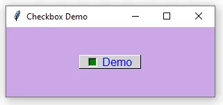
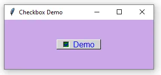
#~~ create a window with a TITLE and background colour ~~
window = Tk()
window.geometry("300x100")
window.title("Checkbox Demo")
window.config(background="#caa7e6")
#~~ Create a Checkbutton ~~
var = IntVar()
checkbutton = Checkbutton(window, text="Demo", variable=var,
onvalue=1, offvalue=0, command=on_button_toggle)
#~~ Setting options for the Checkbutton ~~
checkbutton.config(bg="lightgrey", fg="blue", font=("Arial", 12),
selectcolor="green", relief="raised", padx=10, pady=10, borderwidth=1)
#~~ Adding a bitmap to the Checkbutton ~~
#checkbutton.config(bitmap="info", width=20, height=2) # <-- replaces text with an icon
#~~ Placing the Checkbutton in the window ~~
checkbutton.pack(padx=40, pady=40)
# Calling methods on the Checkbutton
checkbutton.flash()
window.mainloop()
We will make a program to ask the user if they prefer Apple or Android devices. To follow along with this exercise you will need to download a couple of logos with transparent backgrounds. Below are a couple I made earlier:
The output:

The code:
from tkinter import *

#~~ Create Window object and setup GUI Section ~~
window = Tk()
window.geometry("600x400")               # <-- sets the window to 600 x 400 pixels
window.title("Apple VS Android?")        # <-- places a name in the header bar
window.config(background="#caa7e6")      # <-- changes the window background colour

# ~~ create the DISPLAY RESULTS function ~~
def display_result():
    if(apple.get()==1)&(android.get()==0):
        print("I like Apple")
    elif(apple.get()==0)&(android.get()==1):
        print("I like Android")
    elif(apple.get()==1)&(android.get()==1):
        print("I like both Apple & Android (I'm a little strange)")
    else:
        print("I don't like either")

#~~ Create a variable for each checkbox to hold information about whether it's checked ~~
apple = IntVar()                         # <-- associates a variable with each Checkbutton
android = IntVar()

#~~ STYLING OPTION 1 - Create a Checkbutton for Apple ~~
checkboxApple = Checkbutton(window, text='Apple',        # these 5 lines are the minimum required
                            variable=apple,              # associates the variable 'apple'
                            onvalue=1,                   # assigns 1 to 'apple' if checked
                            offvalue=0,                  # assigns 0 to 'apple' if unchecked
                            command=display_result)      # calls the 'display_result' function
# ~~ The following lines continue to style the same Apple checkbox ~~
checkboxApple.config(font=('Arial',20))                    # changes the font
checkboxApple.config(fg='#111111')                         # foreground color
checkboxApple.config(bg='#ffffff')                         # background color
checkboxApple.config(activeforeground='#ffffff')           # active foreground color
checkboxApple.config(activebackground='#999999')           # active background color
photo = PhotoImage(file='apple-logo.png')                  # sets image to PhotoImage
checkboxApple.config(image=photo,compound='left')          # display image to LEFT of text
checkboxApple.config(padx=25,pady=10,width=250,height=150)
checkboxApple.config(anchor='w')      # anchors widget to relative cardinal direction

#~~ STYLING OPTION 2 - Create a Checkbutton for Android ~~
checkboxAndroid = Checkbutton(window, text='Android',
                              variable=android,            # associates the variable 'android'
                              onvalue=1,                   # assigns 1 to 'android' if checked
                              offvalue=0,                  # assigns 0 to 'android' if unchecked
                              command=display_result,      # calls the 'display_result' function
                              font=('Arial',20),           # changes the font
                              fg='#85c707',                # foreground colour
                              bg='#000000',                # background colour
                              activeforeground='#000000',  # active foreground colour
                              activebackground='#006600',  # active background colour
                              padx=25,
                              pady=10,
                              width=250,
                              height=150,
                              anchor='w')                  # cardinal direction n,e,w,s

photoAndroid = PhotoImage(file='android-logo.png')         # sets image to PhotoImage
checkboxAndroid.config(image=photoAndroid,compound='left') # display image to LEFT of text

#~~ Main layout and order ~~
checkboxApple.pack()
checkboxAndroid.pack()

window.mainloop()
Instead of sending the output to the terminal, we can send it to the GUI using a Label. Below is the same cade as above, only this time the output will display in the GUI. We’ll need to make the GUI a little wider to fit it in. Only the changes have been highlighted:
from tkinter import *

#~~ Create Window object and setup GUI Section ~~
window = Tk()
window.geometry("1000x500")              # <-- sets the window to 1000 x 500 pixels
window.title("Apple VS Android?")        # <-- places a name in the header bar
window.config(background="#caa7e6")      # <-- changes the window background colour

# ~~ create the DISPLAY RESULTS function ~~
result_text = StringVar(window)  # Create StringVar AFTER creating the window
def display_result():
    if (apple.get() == 1) & (android.get() == 0):
        result_text.set("You like Apple")  # Use result_text.set() to update
    elif (apple.get() == 0) & (android.get() == 1):
        result_text.set("You like Android")
    elif (apple.get() == 1) & (android.get() == 1):
        result_text.set("You like both Apple & Android (you're a little strange)")
    else:
        result_text.set("You don't like either")

#~~ Create a variable for each checkbox to hold information about whether it's checked ~~
apple = IntVar(window)                         # <-- associates a variable with each Checkbutton
android = IntVar(window)

#~~ Create a Checkbutton for Apple ~~
checkboxApple = Checkbutton(window, text='Apple',        # these 5 lines are the minimum required
                            variable=apple,              # associates the variable 'apple'
                            onvalue=1,                   # assigns 1 to 'apple' if checked
                            offvalue=0,                  # assigns 0 to 'apple' if unchecked
                            command=display_result)      # calls the 'display_result' function
# ~~ STYLING OPTION 1 - The following lines continue to style the checkbox ~~
checkboxApple.config(font=('Arial',20))                    # changes the font
checkboxApple.config(fg='#111111')                         # foreground color
checkboxApple.config(bg='#ffffff')                         # background color
checkboxApple.config(activeforeground='#ffffff')           # active foreground color
checkboxApple.config(activebackground='#999999')           # active background color
try:                                                       # add some existence validation
    photo = PhotoImage(file='apple-logo.png')              # sets image to PhotoImage
    checkboxApple.config(image=photo,compound='left')      # display image to LEFT of text
except TclError:
    print("Error: apple-logo.png not found. Please ensure the image file is in the same directory.")
checkboxApple.config(padx=25,pady=10,width=250,height=150)
checkboxApple.config(anchor='w')                     # anchors widget to relative cardinal direction

#~~ STYLING OPTION 2 - Create a Checkbutton for Android ~~
checkboxAndroid = Checkbutton(window, text='Android',
                              variable=android,            # associates the variable 'android'
                              onvalue=1,                   # assigns 1 to 'android' if checked
                              offvalue=0,                  # assigns 0 to 'android' if unchecked
                              command=display_result,      # calls the 'display_result' function
                              font=('Arial',20),           # changes the font
                              fg='#85c707',                # foreground colour
                              bg='#000000',                # background colour
                              activeforeground='#000000',  # active foreground colour
                              activebackground='#006600',  # active background colour
                              padx=25,
                              pady=10,
                              width=250,
                              height=150,
                              anchor='w')                  # cardinal direction n,e,w,s

try:                                                       # add some existence validation
    photoAndroid = PhotoImage(file='android-logo.png')         # sets image to PhotoImage
    checkboxAndroid.config(image=photoAndroid,compound='left') # display image to LEFT of text
except TclError:
    print("Error: android-logo.png not found. Please ensure the image file is in the same directory.")

# ~~ create the LABEL to output the function DISPLAY_RESULT ~~
result_label = Label(window,
              textvariable=result_text,  # Link the label to the StringVar
              bg='#caa7e6',
              font=('Monospace',24))

#~~ Main layout and order ~~
checkboxApple.pack()
checkboxAndroid.pack()
result_label.pack()

window.mainloop()