Back to: Python Programming
A Label is a widget that is used to implement display boxes where you can place text or images. The text displayed by this widget can be changed any time you want. It is also used to perform tasks such as underlining the part of the text and spanning the text across multiple lines. It is important to note that a label can use only one font at a time to display text. To use a label, you just have to specify what to display in it (this can be text, a bitmap, or an image).
To create a label we first create a window, then we add the label. We give the label a unique name and instantiate the label with the code label = Label() – here the parenthesis are acting as the constructor for this widget (our label) and we can pass in arguments into these parenthesis. The first argument is a master, the container for this label (widget), we are going to pass in the name of our window, because our window is acting as the container. With widgets in python we can separate the arguments we are passing in with a comma. There are options available to us. Options are key-word arguments that we can pass in to the constructor for this widget.
Syntax: Label ( master, option )
Parameters:
- master: This represents the parent window
- options: Below is the list of most commonly used options for this widget. These options can be used as key-value pairs separated by commas.
One option available to us is text, we can set the text of this label equal to a string like “Hello World”.
Lastly, we then need to add the label to our window. We can do this by using label.pack() which will place the widget in the top centre of our window by default. A better option is to use label.place(x=0,y=0) which will use the coordinates to specify where the widget should go.
We are building on from the example created in the previous module – the highlighted parts are new:
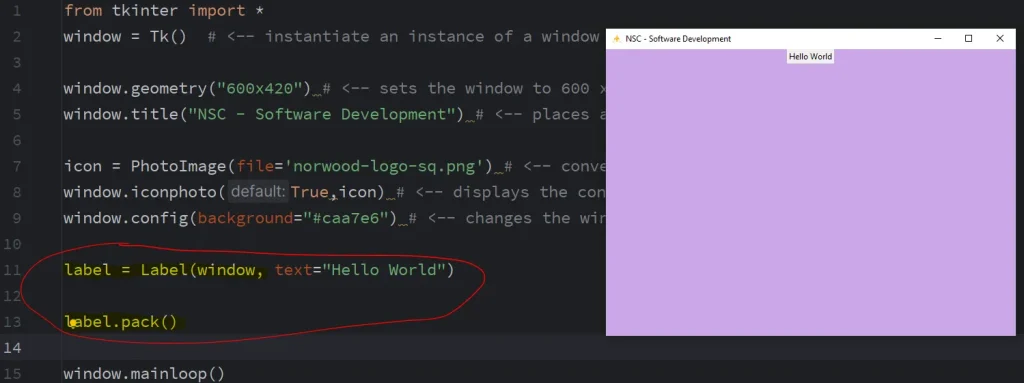
from tkinter import *

window = Tk()                                 # <-- instantiate an instance of a window

window.geometry("800x420")                    # <-- sets the window to 800 x 420 pixels
window.title("NSC - Software Development")    # <-- places a name in the header bar

icon = PhotoImage(file='norwood-logo-sq.png') # <-- converts the PNG file
window.iconphoto(True,icon)                   # <-- displays the converted PNG image
window.config(background="#caa7e6")           # <-- changes the window background colour

label = Label(window, text="Hello World")

label.pack()
#label.place(x=0,y=0)

window.mainloop()
Outputs:
The numerous options available allows us to customise the label to make it look the way you want it to look:
Tkinter Label Options
- anchor: This option is used to control the positioning of the text if the widget has more space than required for the text. The default is
anchor=CENTER, which centers the text in the available space. - bg: This option is used to set the normal background colour displayed behind the label and indicator.
- height: This option is used to set the vertical dimension of the new frame.
- width: Width of the label in characters (not pixels!). If this option is not set, the label will be sized to fit its contents.
- bd: This option is used to set the size of the border around the indicator. Default bd value is set on 2 pixels.
- font: If you are displaying text in the label (with the text or textvariable option), the font option is used to specify in what font-face that text in the label will be displayed.
- cursor: It is used to specify what cursor to show when the mouse is moved over the label. The default is to use the standard cursor.
- textvariable: As the name suggests it is associated with a Tkinter variable (usually a StringVar) with the label. If the variable is changed, the label text is updated.
- bitmap: It is used to set the bitmap to the graphical object specified so that, the label can represent the graphics instead of text.
- fg: The label colour, used for text and bitmap labels. The default is system specific. If you are displaying a bitmap, this is the colour that will appear at the position of the 1-bits in the bitmap.
- image: This option is used to display a static image in the label widget.
- padx: This option is used to add extra spaces between left and right of the text within the label. The default value for this option is 1.
- pady: This option is used to add extra spaces between top and bottom of the text within the label. The default value for this option is 1.
- justify: This option is used to define how to align multiple lines of text. Use LEFT, RIGHT, or CENTER as its values. Note that to position the text inside the widget, use the anchor option. Default value for justify is CENTER.
- relief: This option is used to specify appearance of a decorative border around the label. The default value for this option is FLAT.
- underline: This is self explanatory
- wraplength: Instead of having only one line as the label text it can be broken into to the number of lines where each line has the number of characters specified to this option.
from tkinter import *

window = Tk()  # <-- instantiate an instance of a window

window.geometry("800x420") # <-- sets the window to 800 x 420 pixels
window.title("NSC - Software Development") # <-- places a name in the header bar

icon = PhotoImage(file='norwood-logo-sq.png') # <-- converts the PNG file
window.iconphoto(True,icon) # <-- displays the converted PNG image
window.config(background="#caa7e6") # <-- changes the window background colour

label = Label(window,
              text="Norwood Secondary College",
              font=('Arial', 40, 'bold'),        # <-- the font face, font size and weight
              fg='#dedede',                      # <-- foreground colour (HEX or colour names)
              bg='#5c068c',                      # <-- background colour (HEX or colour names)
              relief=RAISED,                     # <-- border style (RAISED or SUNKEN)
              bd=10,                             # <-- border width (in pixels)
              padx=20,                           # <-- x padding (in pixels) adds space on left/right
              pady=20,                           # <-- y padding (in pixels) adds space on top/bottom
              image=icon,                        # <-- Adds an image to our label on to of text
              compound='bottom')                 # <-- moves the image top, bottom, left or right

label.pack()
#label.place(x=0,y=0)

window.mainloop()
Outputs:

Labels (and many other widgets in python) will resize to accommodate the size of all of the components within.